
- Mid-air brawl forces Delta plane to make an unscheduled stop
- Here's how much Google paid the MBA student who briefly owned Google.com
- Photographer donates services to parents who may have to say goodbye
- Zika virus: CDC warns pregnant women not to travel to these countries
- Dog saves its owner from deadly snake sneaking up on him
Sometimes, change is a good thing. Sometimes, people say it's unnecessary.
Yet, many companies change and update their logos in order to stay fresh, hip and desirable to consumers.
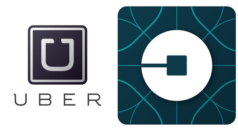
Wednesday, Uber, the ultra-popular mobile ride company, changed its logo in an attempt to work in both "the atom" and "the bit." The company also made the change in an effort to use color patterns sourced from countries all around the world.
The company believed its previous logo looked "somewhat distant and cold," believing that it "belied what Uber actually is — a transportation network, woven into the fabric of cities and how they move," according to the company's website.
But social media users aren't supportive of the change. They seem to think Uber's previous design was good enough.
In Other News
1
The Senate passes a reauthorization of a key US surveillance program...
2
Donald Trump will use his weekend reprieve from the courtroom to...
3
Republicans' defense of the 'Biden 16' House districts starts with...
4
Israeli airstrike in southern Gaza city of Rafah kills at least 9...
5
Biden avoids a further Mideast spiral as Israel and Iran show...